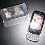
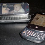
So why did I decide to run out on day one to the Palm Pre rush? One, we were doing development with the Pre; and two it was cool that I was a part of the Pre rush! With all the signage saying “Pre-order your Pre”, I thought it will be another phenomenon like the Android and iPhone. It turned out to be a bit of a bust. I walked into my local Best Buy desperately trying to get someone’s attention to sell me a phone, there was only 1 salesperson at that point and she was helping this lady who was trying to buy something like the Pre, but not willing to pay full price for the phone (can you say cheap?). A second sales guy arrived and tried to sell me the phone but didn’t know how to go through the order system (ummm.. is this a PDA phone or 1X? What plan can you attach on a phone with no contract?), but 20 minutes later I got out with the Pre.
BTW: whatever Pre-sales training they had, they didn’t know how to activate the phone or even turn it on. It was frustrating to see the sales guy brutally destroying this beautiful package.
First impression:
- Packaging: small and sleek. I am not an environmental freak but this is what all phones should be shipped in! Not this cardboard crap and oversize packaging. Palm did a great job making a great first impression. I am sure Bell had nothing to do with this.
- Phone: smaller than I anticipated. It may be a bit thick (same as my N97) but definitely smaller. As many have already noticed, when you slide out the keyboard, the bottom of the keyboard has quite a sharp edge – enough to be a paint scraper (and create skinning accidents – perhaps they need to bundle band-aids). The build quality is good – no loose parts, and the slider is very firm.
- First power-on: can I say slow. My god, I thought the Nokia N97 boot-up was terrible, this is going down in the books as the slowest booting phone. It has an ARM Cortex A8 dual-core processor just like the iPhone 3GS, and it boots up like Windows Vista (yes, terrible jab at Microsoft, but at least Windows Mobile 6 boots up marginally faster).
- User interface: 10 for the font choice, 9.5 for the colour, 9.5 for the icon, and 0 for the rounded corner around the screen. It’s a rectangular screen, give us all the pixels we paid for, not this Mac-esque rounded corner of System 6/7/8. Rounded corners around the screen is so passe.
- Applications: there just isn’t a lot of applications on the phone or in their beta store, but at least it’s functional and easy to use. Though if you are listening music while doing other work, you will see the phone stuttering just a little bit.
- iTunes support: what can I say… it’s a good feature! I wish other manufacturers would challenge Apple in their own game
- Synchronization: I give this a 11 out of 10 for Palm. They really got this right, and glad they are not letting the mobile providers screw around with this important feature! The ability to do server sync right from the activation, download contacts from Facebook, IM with AIM and GTalk, and Exchange ActiveSync support, this is a true messaging phone.
Overall – it’s a cool phone, but it’s a bit PREmature and rough around the edges (no pun intended for both). It’s really the only real alternative to the BlackBerry for Bell users. It won’t save Bell (or Telus when the exclusivity is over) from losing customers to Rogers or Fido. CDMA/EVDO is dead.

